


An expandable SaaS platform for healthcare providers
Disclaimer
The work this case study is based on is subject to a non-disclosure agreement. All branding and identifying product information has been changed to protect intellectual property.

Project Overview
Hemisphere Health provides Autonomous AI diagnostic services for Magnetic Resonance Imaging (MRI) applications, offering real-time diagnoses for a host of brain diseases.
The Problem
Previously, when a user conducted an exam using the Hemisphere+ client, the images and result report were saved in a file on the local machine. If a user ever needed to retrieve a result, they would need to search for it on the PC on which the client is installed. There was no centralized location for a customer to view all of their exam data. In a few cases, Hemisphere Health Support would need to regenerate results for customers that lost data due to hard drive failures.
My Role
Lead Designer
Timeline
6 Months Total
Research
Identifying Stakeholders
The team's assignment was nebulous: "design a customer portal" was about the extent of the ask from leadership and there wasn't alignment on what a customer portal means to Hemisphere Health.
Before starting research, we needed to understand where we should be targeting our efforts by identifying key internal stakeholders and distilling down what we hope to accomplish with this product. I organized a group of leaders from the Customer Success, Sales, Marketing, Product, and Engineering teams to kick off the project and set expectations for what could be accomplished in the six month timeline the team was given. We identified several functions that we would like to incorporate into a customer portal like reporting, training, configuration management, and physician grading, but we decided to start with result viewing.
User Research
With a clearer objective, I worked with my team to plan user research. We created a list of open-ended questions intended to help us understand the needs of our customers and coordinated with our Customer Success team to recruit customers for a series of interviews. We recruited five customers and interviewed both an exam operator and an administrator at each.
5
out of 5
Operators expressed that it is cumbersome to retrieve Exam Result PDFs on the local machine.
4
out of 5
Administrators find it difficult to reconcile which results have and have not been uploaded to the EHR.
5
out of 5
4
out of 5
Administrators want to see their metrics outside of regular touchpoints with Customer Success.
Competitive Analysis
To better understand the competitive landscape, we identified several products in and outside the healthcare space and compared how they handle displaying data. We looked at some well-known EHR's, PACS image viewers, lab products and consumer products to assess their strengths, weaknesses, and how we might want to design our product to be consistent with what customers are already using.
Personas
This project introduced a new user: the administrator. The administrator persona encompasses several roles including project manager, clinical manager, trainers, and team leads. Using the insights gathered from user research, we created a persona for the admin. We used this persona along with our operator persona to inform the design. Where this product will be used by both clinical staff and administrators, my aim was to design a user experience that is both simple and straight forward for the care team while also providing powerful tools for admin users.

Feature Map
I met with Product and Engineering to create a feature map based on my research findings. Using the MoSCoW prioritization method, we decided which features were needed for the Minimum Viable Product, what were nice-to-have's, and what would not be implemented in this first phase of the portal.

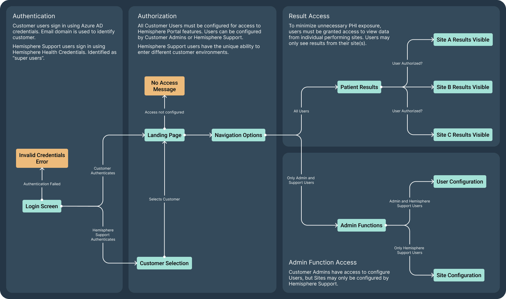
User Flow
Before starting wireframing, I wanted to map out the entire user flow I worked with Product and Engineering to identify what was needed for MVP.
User must be able to log in to the portal. Engineering suggested supporting Azure AD for phase 1.
User permissions must be configurable to control which users can access what data.
Internal users (Hemisphere Health support staff) must be able to access and configure individual customers for troubleshooting and implementation.
Audit logging must be implemented to help ensure HIPAA compliance.
Based on these criteria, I created the user flow below:
Ideation
Brainstorming
With a solid understanding of our user's needs, I began ideating. I started with a series of "How Might We" questions derived from my research to help guide idea generation. From these questions, I started sketching out the foundation of the Hemisphere Web Portal.
How might we…
ensure patient results are easily accessible?
How might we…
help leadership better track exam efficacy and visualize trends?
How might we…
help clinical managers identify underperforming sites?
How might we…
safeguard PHI while giving users access to the data they need?
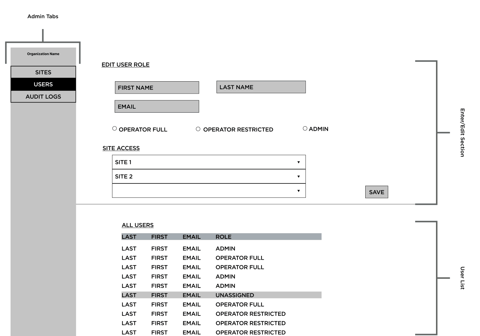
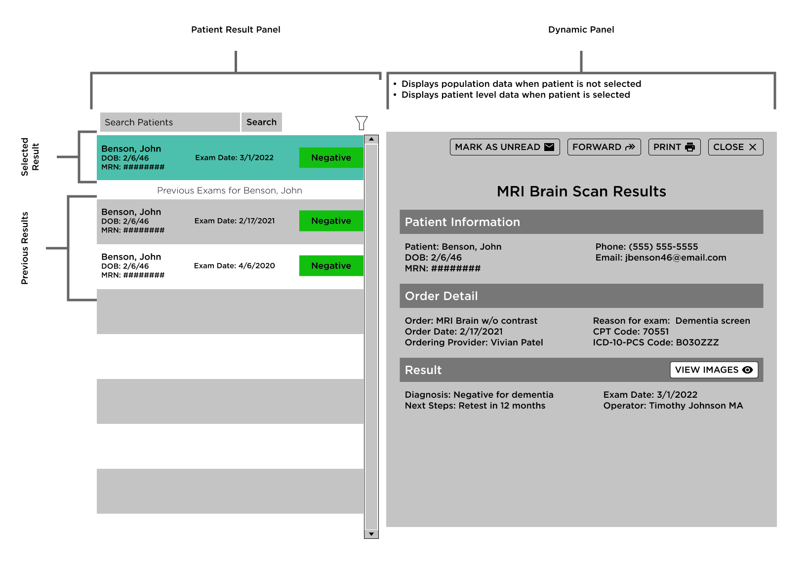
Wireframes
I created a series of wireframes and began working with the product and engineering teams to iterate on them a bit before doing user testing. We didn't have the luxury of having multiple rounds of user testing, so we wanted to refine the wireframes and develop them into mid-fidelity prototypes before putting them in front of users.
Testing
Test Design
To test the design, I created an interactive mid-fidelity prototypes. Where the product would be used by both internal and external users, I recruited 5 Customer Success representatives and coordinated with them to utilize their monthly customer touch-base meeting to test the prototype with them and their customer. I used Microsoft Teams' breakout rooms feature to test with a single user at a time, then regrouped at the end of the call for wrap-up questions and comments. Users were given access to control the Figma prototype and each session was recorded.I asked participants to perform the following tasks:
Customer Operator
Find a specific patient result (I provided them a name and MRN)
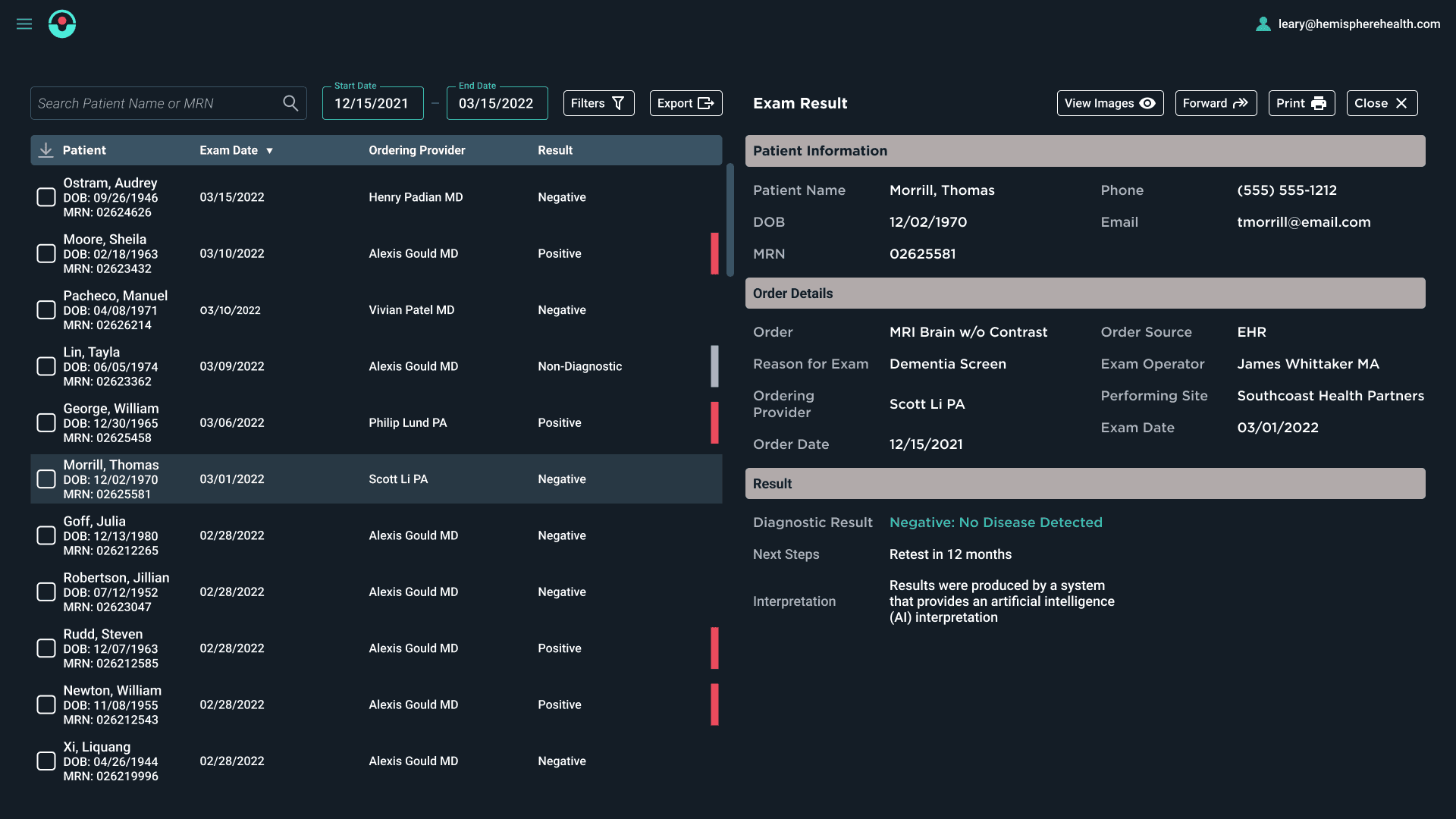
Download the patient's result
Forward the result to a specific provider. This was a last-minute inclusion to the design per leadership's request.
Identify how many times this patient has been imaged in the past
Customer Admin
Find a specific patient result (I provided them an EHR Order ID)
Export a specific range of results to an excel file
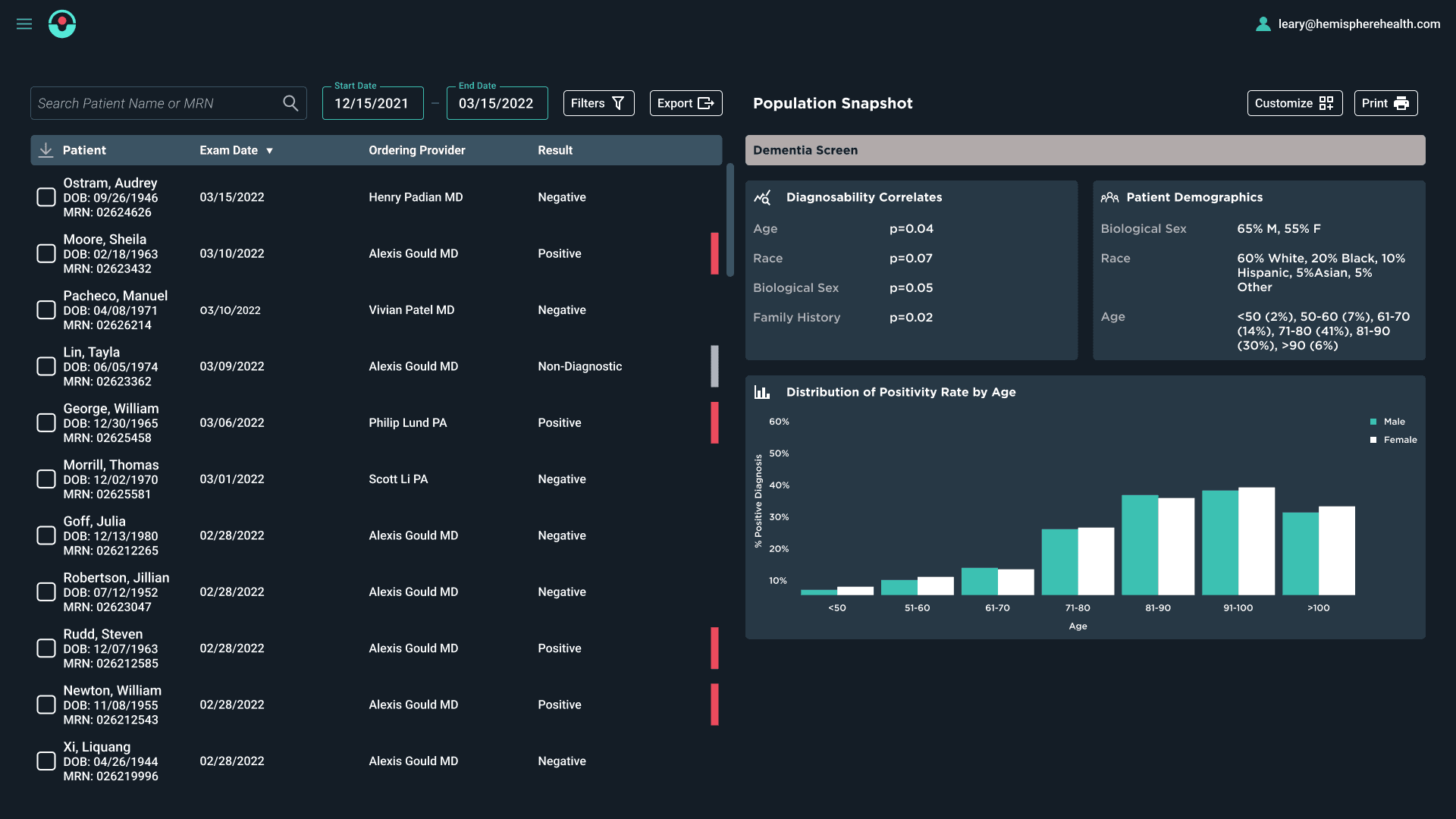
Configure the Population Data widgets to display specific metrics (I gave the user the freedom to explore this without a specific prompt)
Configure a new operator to use the Hemisphere Portal
Hemisphere Support
Access a specific customer
Find a specific patient result (I provided them a Hemisphere+ Submission ID)
Configure a new site for a customer
Mid-Fidelity Mockups
Testing Results
After completing usability testing with 5 customers and their Hemisphere support staff (15 users total), I analyzed my results to identify areas upon which the prototype might be improved. I've broken these key findings down by user type below.
Operators
3
out of 5
struggled initially to figure out how to download a result.
5
out of 7
were able to use the search bar with ease
5
out of 5
found the result sort logic intuitive
4
out of 5
found the provider forwarding feature unnecessary
Administrators
5
out of 5
struggled with the filter menu
5
out of 5
were able to export the result spreadsheet with ease
3
out of 5
found the reporting customization options unnecessary
5
out of 5
struggled with the hamburger menu navigation
Support Staff
5
out of 5
were able to select a customer with ease
1
out of 5
expressed HIPAA concerns with patient data being visible immediately upon accessing customer environment
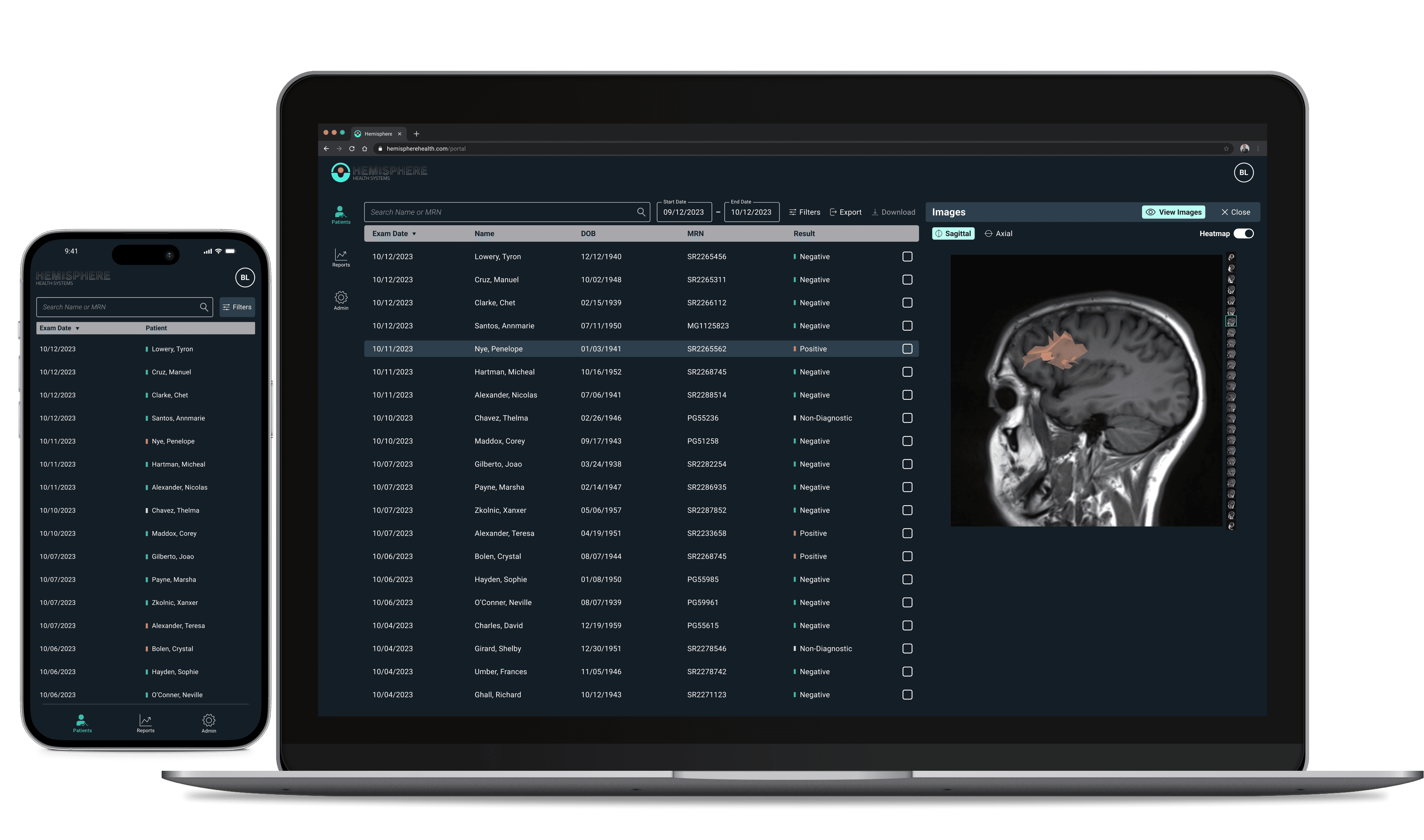
Final Prototype
With the feedback acquired during testing, I began refining the prototype and did another round of testing with Hemisphere Health staff and worked with our Product and Engineering teams to create the final prototype. This took several iterations as Product and Engineering disagreeded on the inclusion of some features previously listed in the "Could Have" quadrant of out Feature Map. We eventually reached a consensus and landed on what would become the first phase of the portal.
What changed
Moved the navigation from a hamburger menu to a side navigation (usability).
Moved the download button so it's with the others. Positioned over the checkbox column (usability).
Added a User Preferences function to allow users to change the UI appearance and set the screen on which the user lands upon logging in (usability, patient privacy).
Changed the table formatting so each field has it's own column rather than having Patient Name, MRN and DOB in a single column (Engineering request).
Removed the Provider Forwarding and Print buttons from Results panel (unnecessary scope).
Scaled back the reporting function for MVP. Rather than a user-configurable report, a PowerBI report will be embedded in an iframe. Same report for all customers (engineering request).
What didn't change
Filter function. This was a usability concern, but the Product team wanted to wait to see if this is an issue in the field since users are trained on use of the product during implementation. Entered as a backlog item.
Date Picker function. Engineering acknowledged the clunkiness of the MUI date picker, but expressed that it would be difficult to customize the component to function as desired. We may add date range presets in the future (ex. 1 week, 1 month, 3 months, etc...) depending on customer feedback after deployment.
Impact
We monitored customer adoption and usage in the months following deployment. Initially, customers were slow to implement the Hemisphere Portal as Customer Success and Engineering worked out the kinks with active directory and database integration. Once these issues were resolved, we saw widespread product adoption among eligible customers. Most of the first users of the product were Customer Administrators, using the reporting and result export features.
Adoption
The Hemisphere Portal saw a near-100% adoption with 96% of eligible customers implementing the product with at least one active user. Customer Administrators made up the bulk of users with 73% of total active users
Efficacy
In the 6 months following deployment, Customer Success reported a 10% reduction in the number of support tickets. This was attributed to customers having a self-service option for retrieving result data and performance metrics.
Revenue
The Hemisphere Portal was offered as a free addition to customers existing Hemisphere+ subscriptions. Following the release of the Portal, requests for more features like operator-level reporting and order integration came in. Many of these requests are planned as paid add-ons.
Learnings
The Hemisphere Portal was one of the more interesting projects I've worked on as a designer. Taking a project from a vague idea to a fully-realized, modular web platform required a lot of careful planning to ensure we didn't paint ourselves into a corner. There were two pitfalls I hoped to avoid:
Being too myopic with the product vision, thus limiting the expandability of the platform.
Trying to solve every problem at once and "throwing the kitchen sink" at it.
I tend to err toward the latter and this project provided a great education on keeping my tendency of "scope creep" in check. We established the MVP early on and I was mindful to document the "nice-to-haves" and add them to the product backlog while also keeping them in mind while designing the first phase. The result is a product that can grow with the business and easily support new features.
