


A redesigned exam experience resulting in a sharp increase in diagnosability
Disclaimer
The work this case study is based on is subject to a non-disclosure agreement. All branding and identifying product information has been changed to protect intellectual property.

Project Overview
Hemisphere+ is an autonomous Artificial Intelligence system that uses machine learning algorithms to provide real-time diagnoses for a number of brain diseases. The product is designed to be used by non-providers with minimal training while ensuring fast and accurate results.
The Problem
Exam diagnosibility metrics indicated that approximately 25% of total exams were non-diagnostic due to image quality and protocol failures. Additionally, median exam times exceeded Hemisphere Health's marketing claims due to redo non-diagnostic exams.
My Role
Lead Designer
Timeline
6 Weeks Total
Research
Initial Discovery
Before I began user research, I needed to understand the product in its current state. This was my first major project at Hemisphere Health and I lacked a good foundational knowledge of how the product worked, so I set off to learn more.
I worked with our Product and Engineering teams to better understand how the imaging device works and the rationale behind some of the previous UX decisions. I also flew out to our Chicago office to get some hands-on time with the imaging device and Hemisphere+ client.
Something that makes designing for a product like Hemisphere+ so challenging is that we can only control part of the user experience. The application is launched on a laptop that is tethered via an ethernet cable to an imaging device. The imaging device is not manufactured by Hemisphere Health and we do not have control over the imaging device's UI which exists on a small touch screen on the device. Our product simply instructs the user on how to operate the imaging device to take the required images and returns an analysis result.
Key Findings:
The imaging device can be configured for a variety of different exam types, not all of which are supported by Hemisphere+. Configuring the device for the wrong exam type may impact Hemisphere+'s ability to detect disease.
Hemisphere Health has already explored an API to control the imaging device via our software and was unsuccessful. Any sort of API integration is off the table for this project.
The imaging device can only be used on patients that meet certain anatomical criteria. It is crucial to identify these contraindications prior to starting the exam so those patients can be dismissed and referred to a specialist.
The imaging device does not communicate with Hemisphere+ except to pass images to a temp folder on the PC for upload to our analysis system.
The current version of algorithm requires 2 views to be captured to meet the target sensitivity and specificity scores for disease detection.
Hemisphere+ is used exclusively in a dark exam room. We have a light mode theme, but customers are encouraged not to use it. The Product and Engineering teams do not see value in reviewing Light Mode.
Operators are standing a few feet from the laptop when performing the exam. They're not sitting in front of the monitor like a typical PC user. This can make it challenging to read the instructions.
Quantitative Research
With the aid of engineering, I created a PowerBI report to transform and visualize data collected from our exam service. This data, along with my qualitative research helped narrow down the problem areas in our system.
Diagnostic
Protocol Error
Poor Quality
Mean # of Attempts
2.3
Median Exam Time
7 Mins
Exams Abandoned
9.3%
Qualitative Research
To better understand the needs and pain points of our users, I worked with Hemisphere Health's Customer Success team to identify existing customers to engage. I performed User Interviews with 5 customers and 2 Hemisphere Health Implementation Team members to understand how users are trained on the product and how they use it in the field. I also sat in on 3 customer implementations where new users were trained on Hemisphere+.

7
out of 7
Were frustrated by the need to click to advance the instruction screens
4
out of 7
Found the image acquisition sequence cumbersome
5
out of 7
Reported eye strain attempting to read the instruction text
5
out of 7
Reported difficulty understanding why some exams were non-diagnostic
6
out of 7
Found the existing capture instructions confusing and difficult to follow
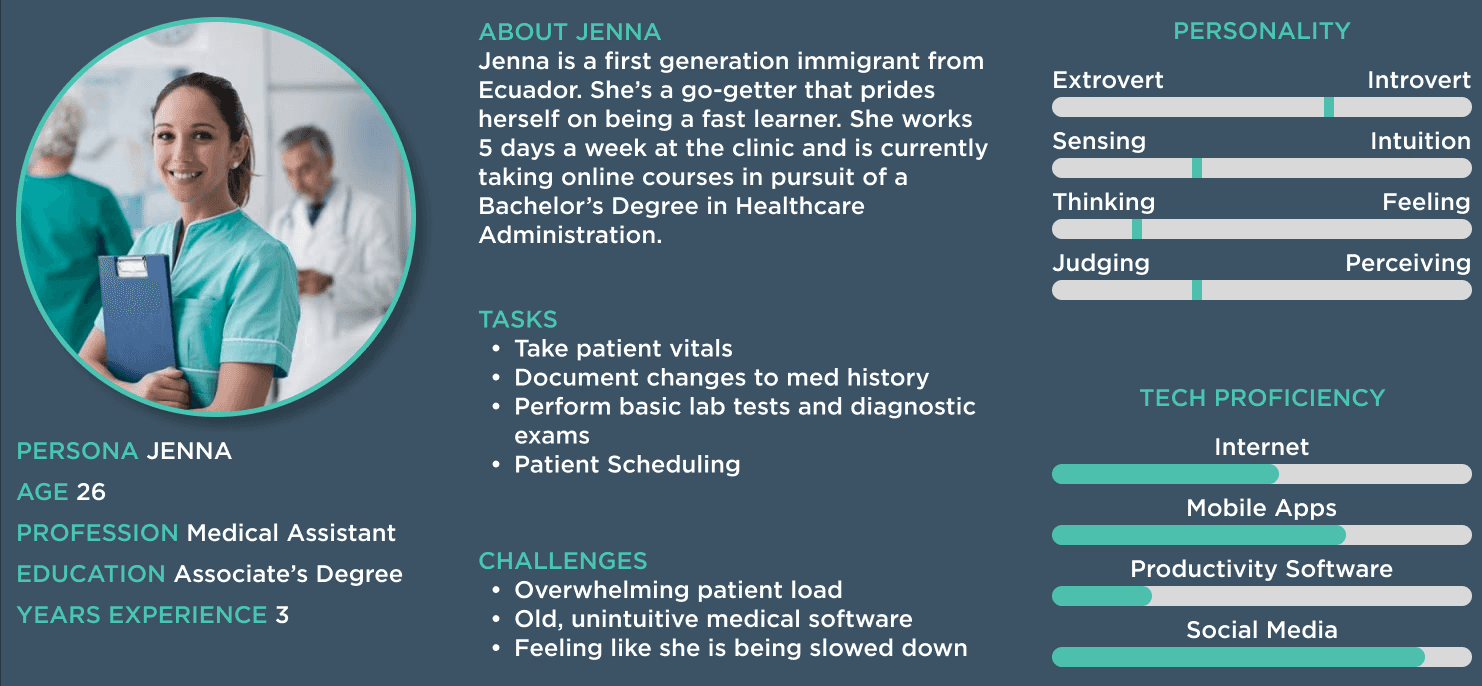
Personas
Using the insights gained from my research, I created a persona to represent our user base. Personas help reinforce the value of our work when getting buy-in from internal stakeholders and collaborating in a cross-functional team with Engineering and QA.
Stakeholder Review
At this point, I've identified several areas likely contributing to our lower-than-expected diagnosability metrics. Also, my discussions with Product and Engineering revealed several constraints I'll need to work within.
I presented my research findings to the Product team and key stakeholders from the Marketing, Engineering, Regulatory, and Sales teams. I proposed that we redesign the exam UI and focus on addressing 4 areas:
Exam Sequence
Change the sequence of images the user is prompted to capture to optimize for efficiency.
Recapture Tips
Provide actionable guidance to the user when an exam is non-diagnostic.
Click Reduction
Reduce the number of clicks a user needs to perform in the UI during the exam.
Accessibility
Improve the legibility and clarity of the on-screen instruction text, taking into account the user's unique use environment (dark exam room, viewing screen from a distance and sometimes off-axis).
Ideation
Technical Constraints
At this point, I've identified several areas likely contributing to our lower-than-expected diagnosability metrics. Also, my discussions with Product and Engineering revealed several constraints I'll need to work within.
Before I even begin ideating potential solutions, I know these options are off the table:
Using an API to control or automate the image capture workflow on the imaging device
Changing anything about the number of images or the type of images we capture during the exam
Brainstorming
With a solid understanding of our user's pain points and the technical/ business constraints, I began brainstorming ideas.
I did two rounds of crazy 8's, first alone, and again with the product team. This generated 24 ideas for a potential UI.
I then took those 24 ideas and distilled them down into 4 wireframes to begin testing and refining.
Testing
Test Design
I worked with my Product Manager to recruit 4 internal Hemisphere Health employees in the Chicagoland area who could come in to do initial wireframe testing.
The goal of this testing was to narrow down our options to one or two designs before proceeding with a more formal customer test. I reached out to new employees at Hemisphere Health to test the prototypes as "naïve users". A member of the Product team played the role of their patient.
Each participant was tested on 2 of the 4 prototypes. I gave participants minimal instructions and asked them to "think out loud" as they ran through the exam workflow. I observed each session, making note of the participants actions, verbal sentiments, and non-verbal cues. I also included a scenario where the "patient" was intentionally difficult to align properly. Following the test, I conducted interviews with each participant.
Mid-Fidelity Test
After testing the wireframes internally, we narrowed down the options to two designs. For customer testing, I created two fully-functional mid-fidelity prototypes in Figma. These prototypes were tested with 4 customers and 3 Hemisphere Health staff members.
Test Design
Participants were asked to perform the exam using one of the two competing prototypes. My product owner sat in as a patient as we simulated the following exam scenarios:
Happy Path
Uncooperative patient (the patient shifts alignment during the exam)
Image Recapture workflow
Poor Quality image results
Participants were invited to share their feedback at the end of the test and were asked follow-up questions based on their performance.

Results
Prototype 1
7
out of 7
Successfully followed the setup instructions
3
out of 7
Expressed confusion about being asked to check patient alignment
6
out of 7
Asked where the verbal patient instructions were
4
out of 7
Noticed the Stop Exam button's color had been changed and approved of the better contrast
7
out of 7
Had no issues reading the instruction text from normal operating distance (~6 feet from the screen)
Prototype 2

6
out of 7
Successfully followed the setup instructions
4
out of 7
Found the teal text in the instructions a bit hard to read despite AA WCAG compliance
2
out of 7
Noticed the slight change to color palette and thought it improved viewing in a dark exam room
3
out of 7
Noted the absense of the patient instructions
7
out of 7
Had no issues reading the instruction text from normal operating distance (~6 feet from the screen)
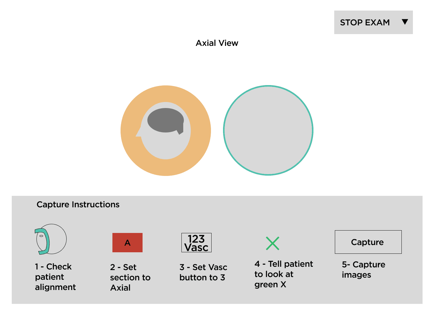
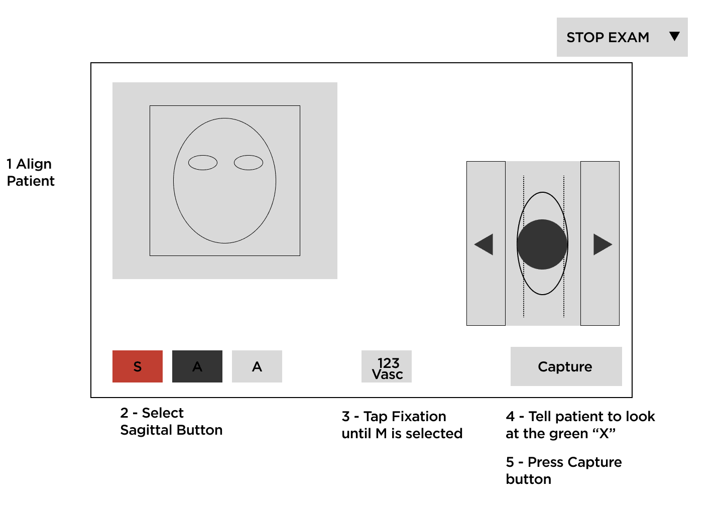
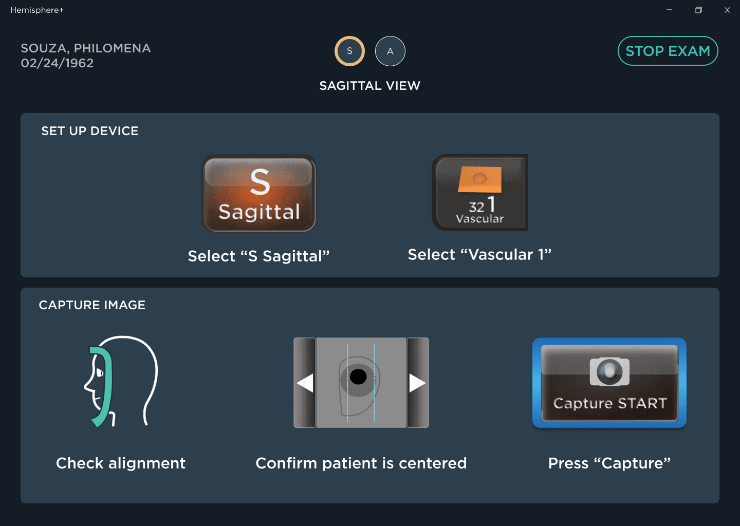
Final Prototype
After testing the two mid-fidelity prototypes with customers, we decided to go forward with Prototype 2 with some minor changes based on testing feedback.
Applying the insights from user testing, I developed the final prototype for handoff to engineering.
This new design introduced the following:
- Dedicated "Setup Checklist" preceding the exam to ensure the patient and user are ready for imaging.
- Completely re-designed image capture flow that includes all necessary instructions for capturing an image array on a single screen (previously, the instructions for each array were split across two screens that the user must navigate between).
- Automatic advancement of the capture instruction screens triggered when an array is captured (previously, the user needed to click "Next" to advance).
- Accessibility enhancements
- Larger instruction text
- WCAG AAA-compliant text contrast
- Instruction copy targeting a Flesch-Kincaid Grade 5 reading level
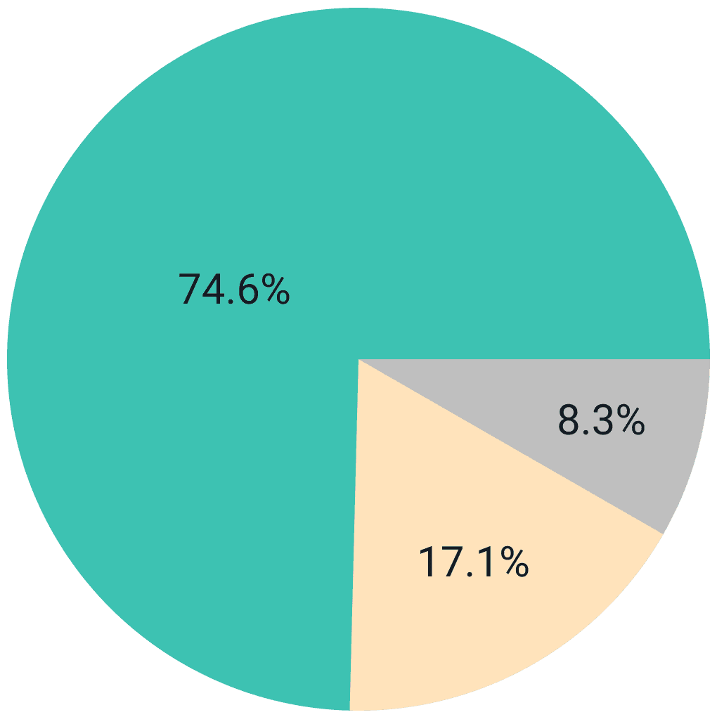
Impact
In the months following release, we monitored customer diagnosability post-update and kept in close contact with the Customer Success team to understand how our changes impacted customer training and implementation.
Diagnosability
Mean diagnosability across all customers rose from 74% to 81% with individual customers seeing improvements of up to 15%.
Exam Speed
Median exam time across customers decreased from 7 minutes to 5.5 minutes.
Training
Customer Success trainers reported that it is much easier to train new users on the new exam workflow.
"Just wanted to give you a shoutout for your leadership/product vision on 3.9. Nikol just trained Sanford and said that it made a huge difference (more efficient, way less questions, far more intuitive). Very grateful to have you at the helm of our product design "
-Meg L. VP of Customer Success
Learnings
This was Hemisphere Health's first experience applying User Centered Design methodology and my first time spearheading a User Research initiative. At past employers, these channels were already established and I simply needed to utilize them. I learned that the customer support team is a designer's best friend when designing for an existing product. They know the customers, their pain points, and can grease the wheels when it comes to getting face time with them, something that isn't always easy in the fast-paced world of healthcare.
